
Visualize Your Data (Tutorial)
Last updated 2026-08-26At a Glance
Any HISE user can contribute data visualizations to a study and share them with other researchers. You can save these visualizations using either the advanced search function or an IDE instance. If you need help or get stuck, contact Support.
Workflow
Regardless of how it was generated, any user can retrieve saved visualizations directly in the study UI. In other words, even if the visualization was generated with an IDE instance, an IDE instance is not needed to see the saved visualization. Using this workflow, analysts can contribute novel visualizations to a study and share their with (non-coding) scientists for review.
Create
Each visualization always comes in two forms: static and interactive. First you create a static image of the visualization to use as a hero image or to insert into a report, such as a Google Doc. Then you save the original interactive visualization and load it into the study.
Save
Anyone with access to a given study can view its saved visualizations on the Visualizations tab in the HISE Collaboration Space.
If a visualization is generated using an IDE instance, the instance is cloned and saved to the study at the same time. By default, visualizations are saved in Draft mode. At this stage, you can review the results with your collaborators. If you're not satisfied with the visualization, delete it and upload a replacement. If you're happy with the result, click Final & Publishable.
Share
The Visualizations tab in each study houses all visualizations generated using either an advanced search or an IDE instance. Only final visualizations can be used in publications.
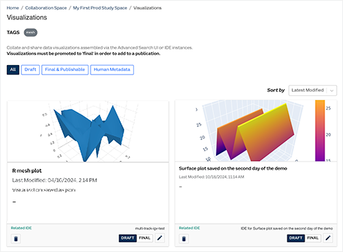
Click on a visualization to see when the visualization was added, when it was last modified, and by whom.
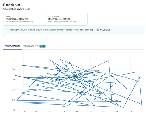
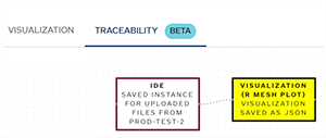
To view CertPro data for the visualization, click the TRACEABILITY tab.
Types of Visualizations
Using an advanced search, you can select results of interest, visualize them, and save the visualizations. You can use either a subjects query or a samples query to save human metadata, or you can use a result files query to save visualizations of the flow cytometry supervised gating pipeline. For details, see Use Advanced Search (Tutorial).
You can also create an IDE and use R or Python to generate Plotly graphs, or use Python to create a complex interactive visualization by building a Dash application.
Plotly graphs
Ploty includes support for the popular ggplot library. To get started, use the sample notebooks in your IDE instance's examples folder. When you're ready to share and upload your visualization to a study, you can use R’s saveVisualization() SDK method or Python’s save_visualization() method. For details, see Use the HISE SDK to Create Visualizations (Tutorial).
Dash applications
Dash applications have a point-and-click interface linked to models written in Python, augmenting the capabilities of a traditional dashboard. General users, as well as scientists and analysts, can easily use Dash to apply complex Python analytics to datasets.To share a Dash application, it must be saved to a study. We provide a Python SDK for you to upload and share your visualizations. For details, see Save Visualizations in HISE (Tutorial)
Related Resources
Save Visualizations in HISE (Tutorial)